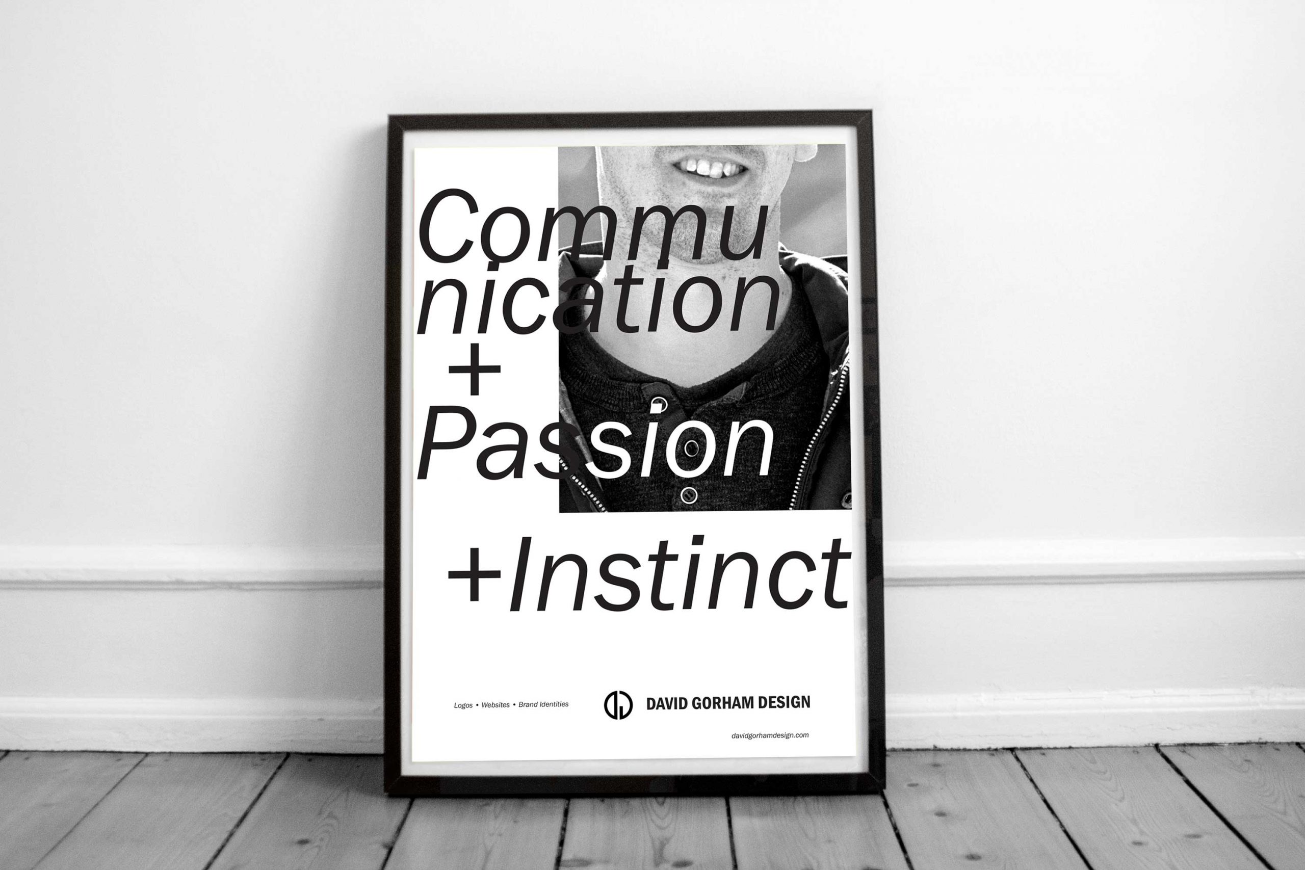
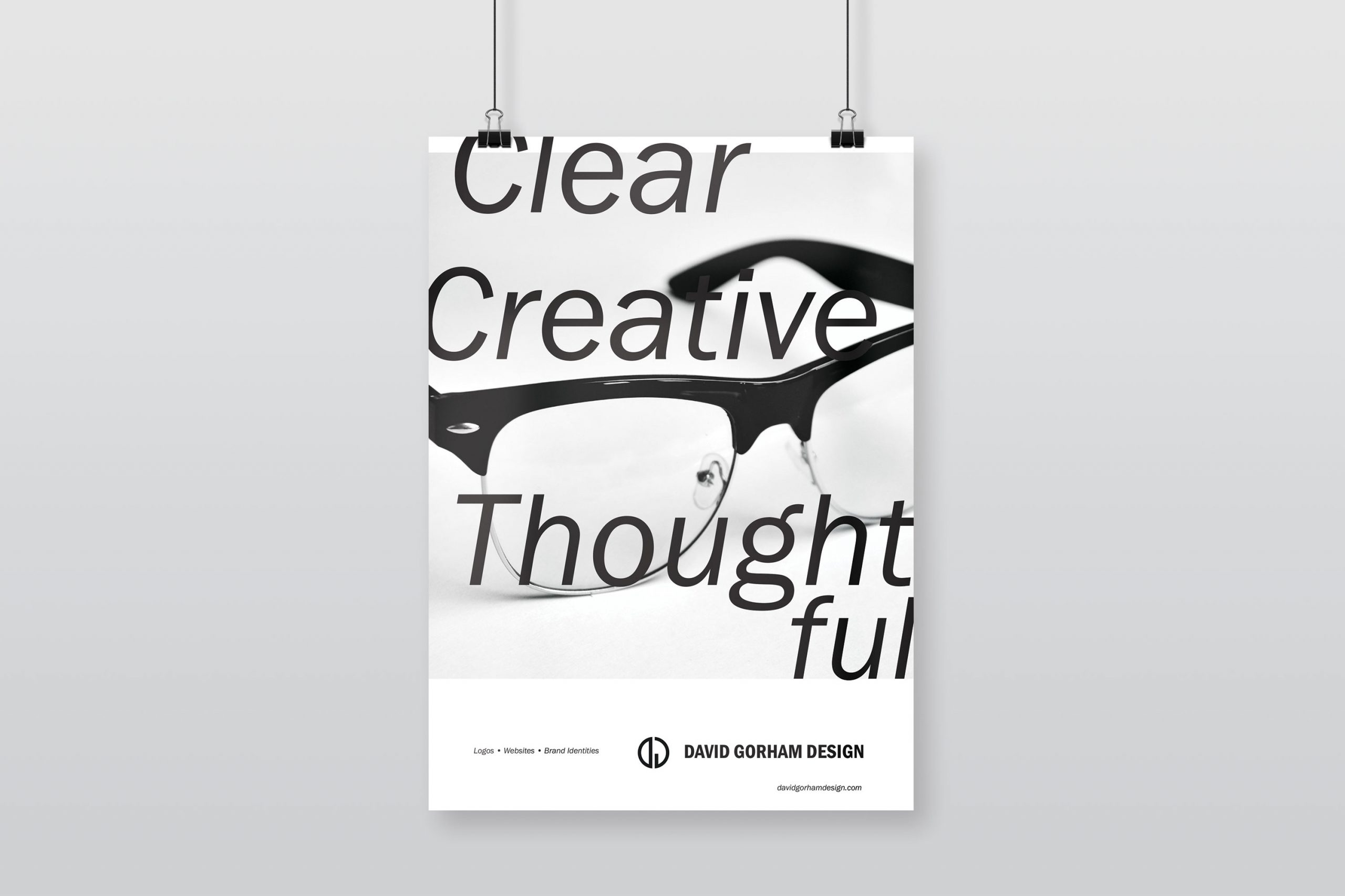
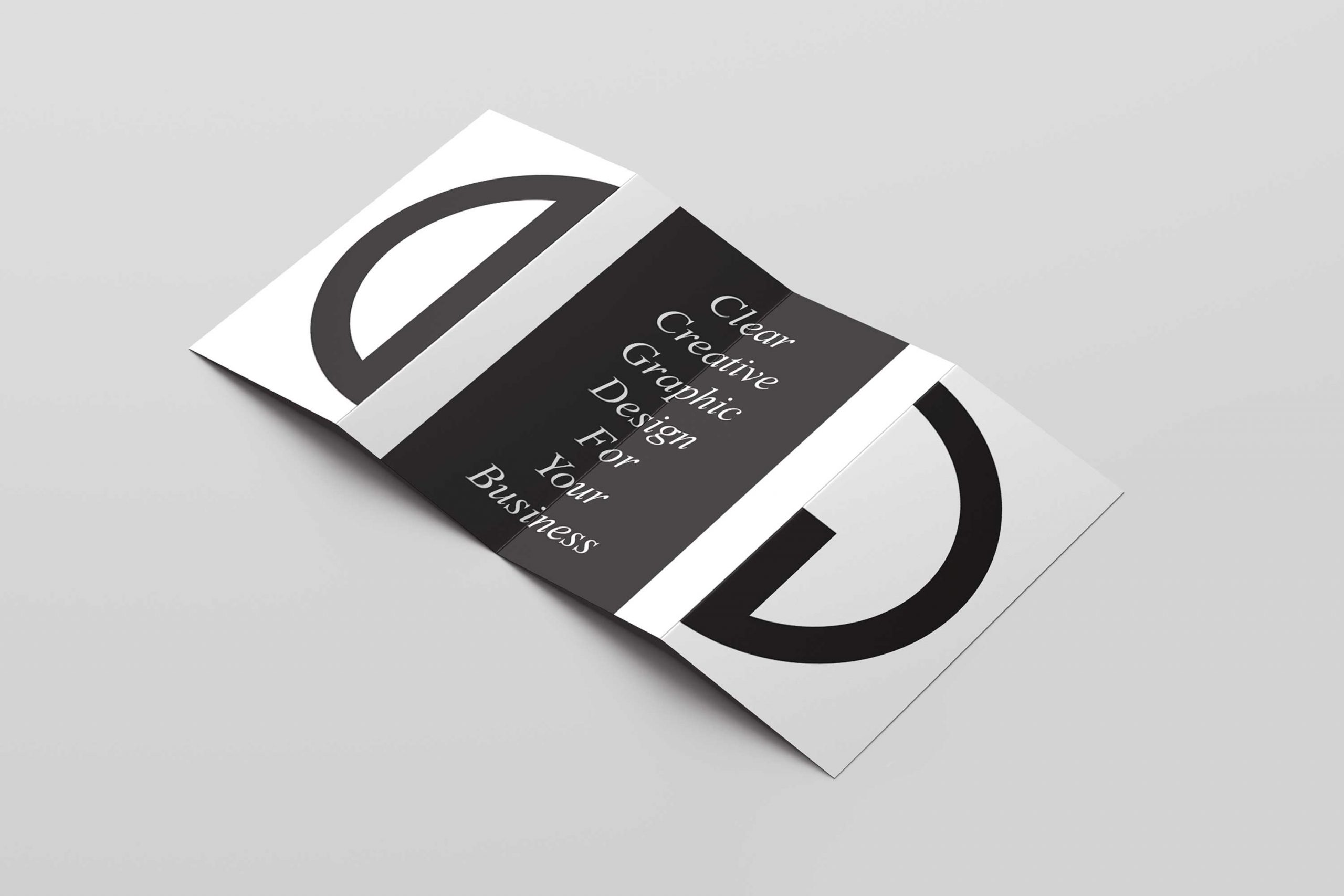
A clear, creative and thoughtful brand new brand identity.
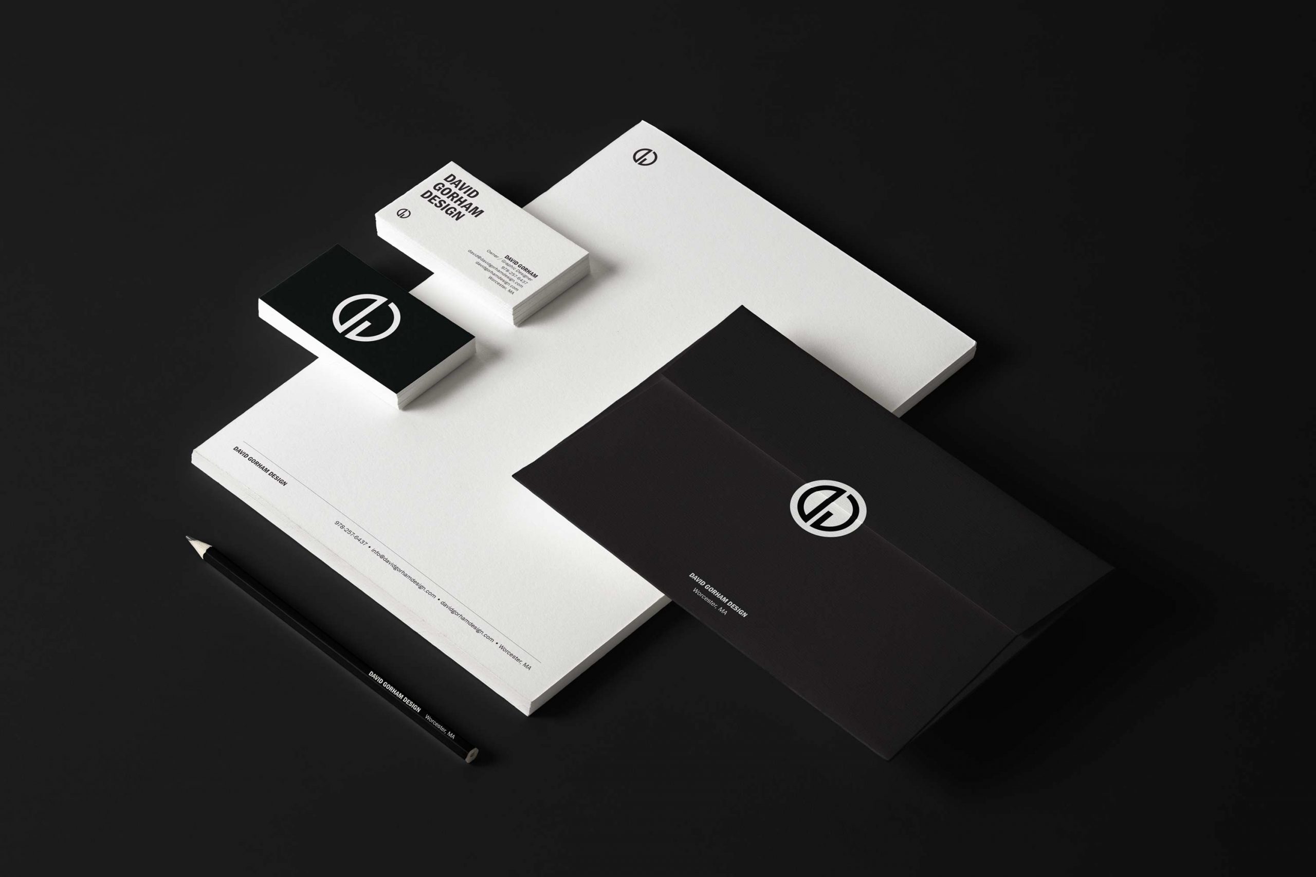
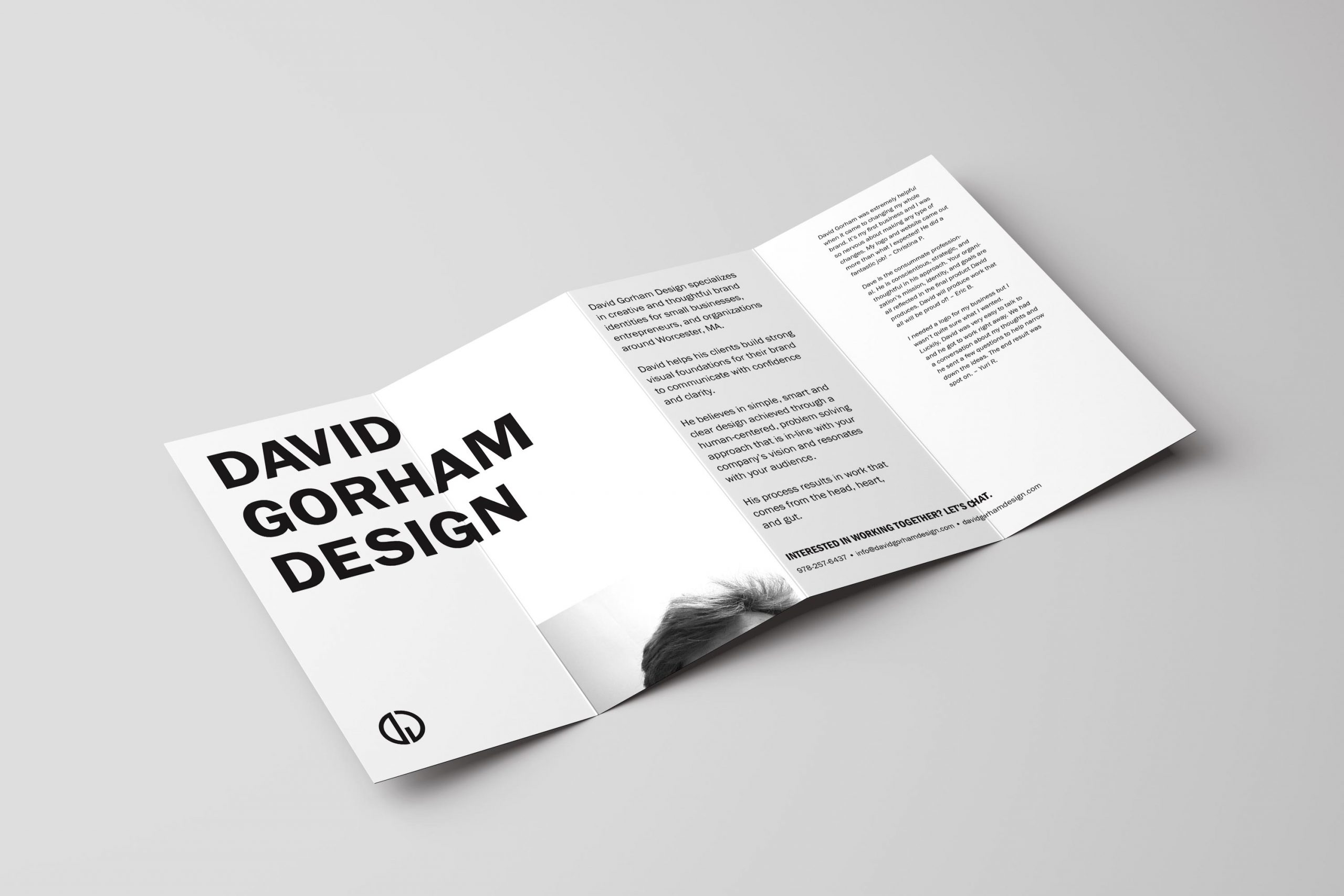
With the launch of a redesigned website, it was also time for a refresh of the whole brand identity system from print to digital. Starting out as a freelance endeavor, a purposefully cohesive branding system was never established for David Gorham Design.
As with many startups, David Gorham Design’s marketing and branding collateral was designed as needed with not much thought to how the individual elements worked together. Over time, this approach was not serving the business’s primary focus of helping other small businesses create strong visual identity systems.
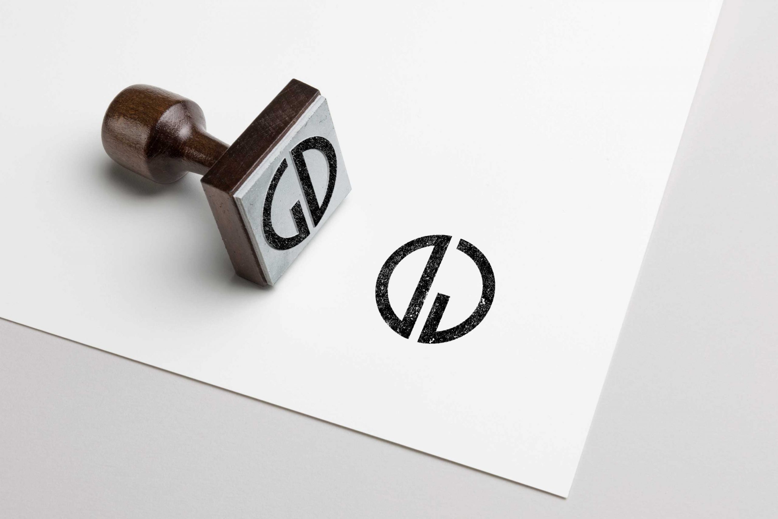
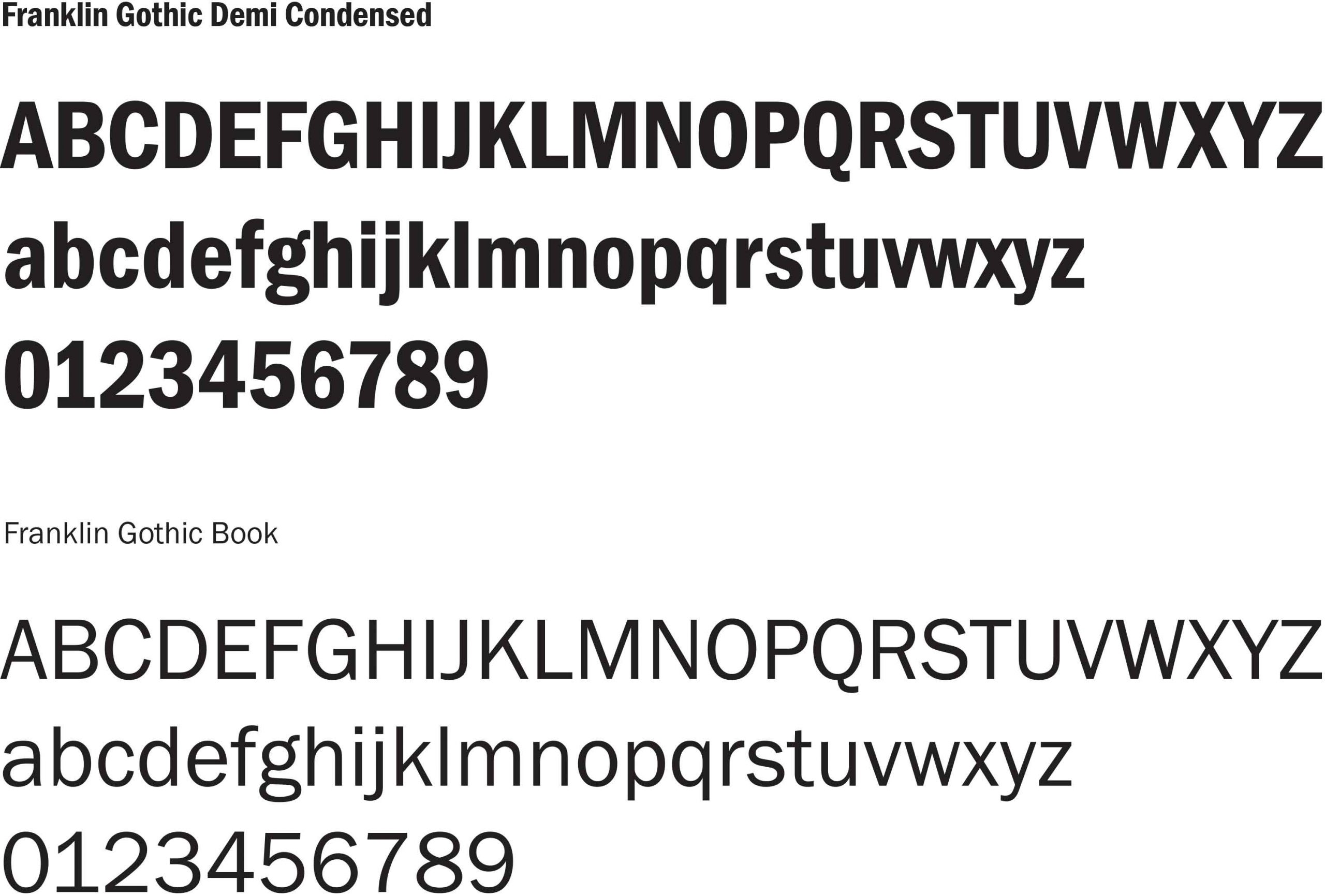
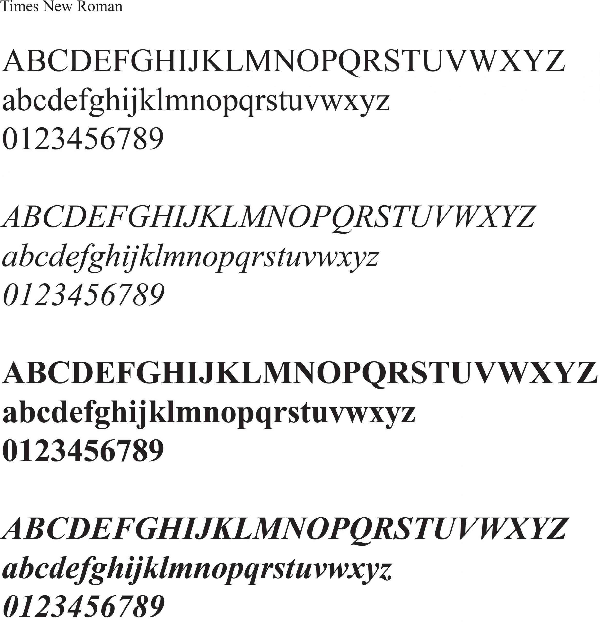
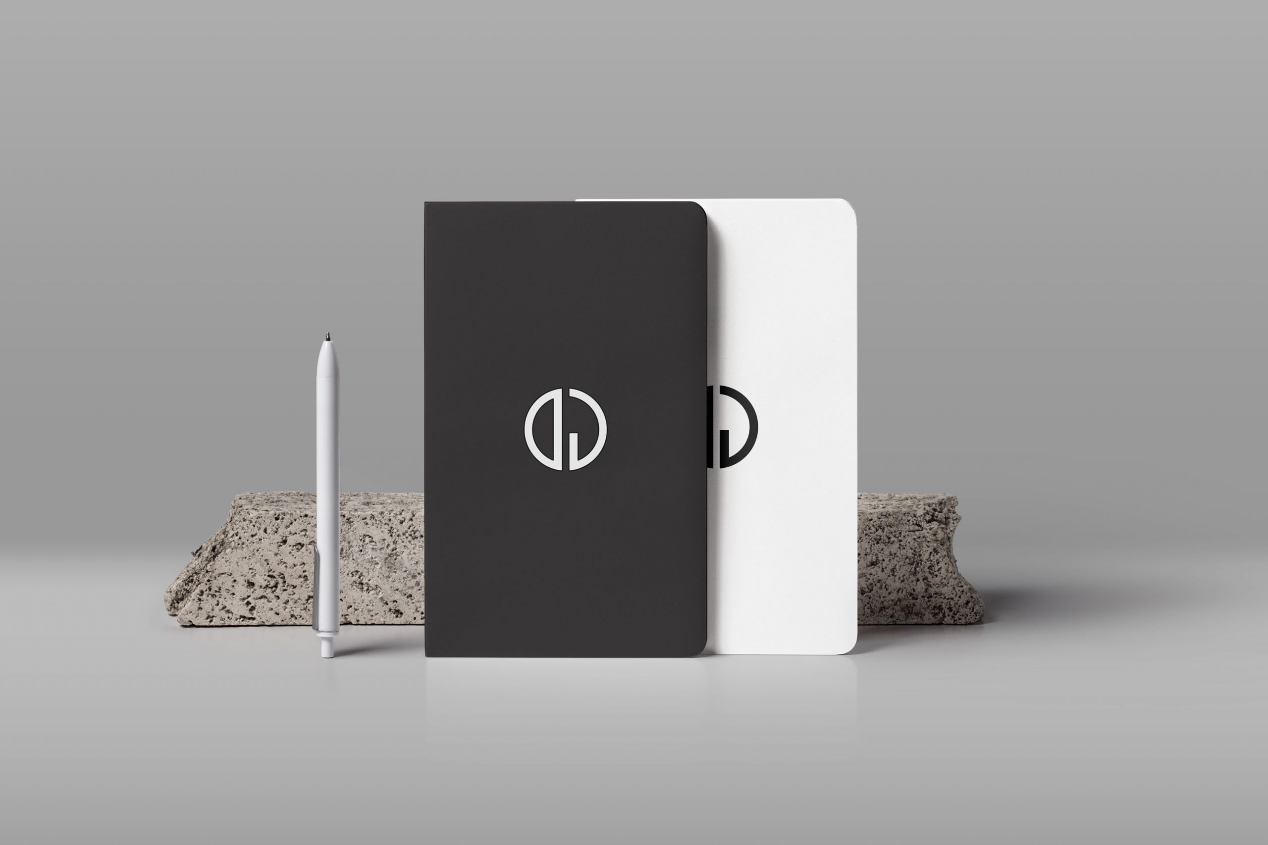
The process began with a study of the components that have been used consistently — the monogram logo, the strong contrasting black and white colors, and the two fonts: Franklin Gothic and Times New Roman. Instead of changing everything, it was decided to use these three elements as the building blocks to help tie everything together.