Why You Need to Spend Time with Your New Logo Design
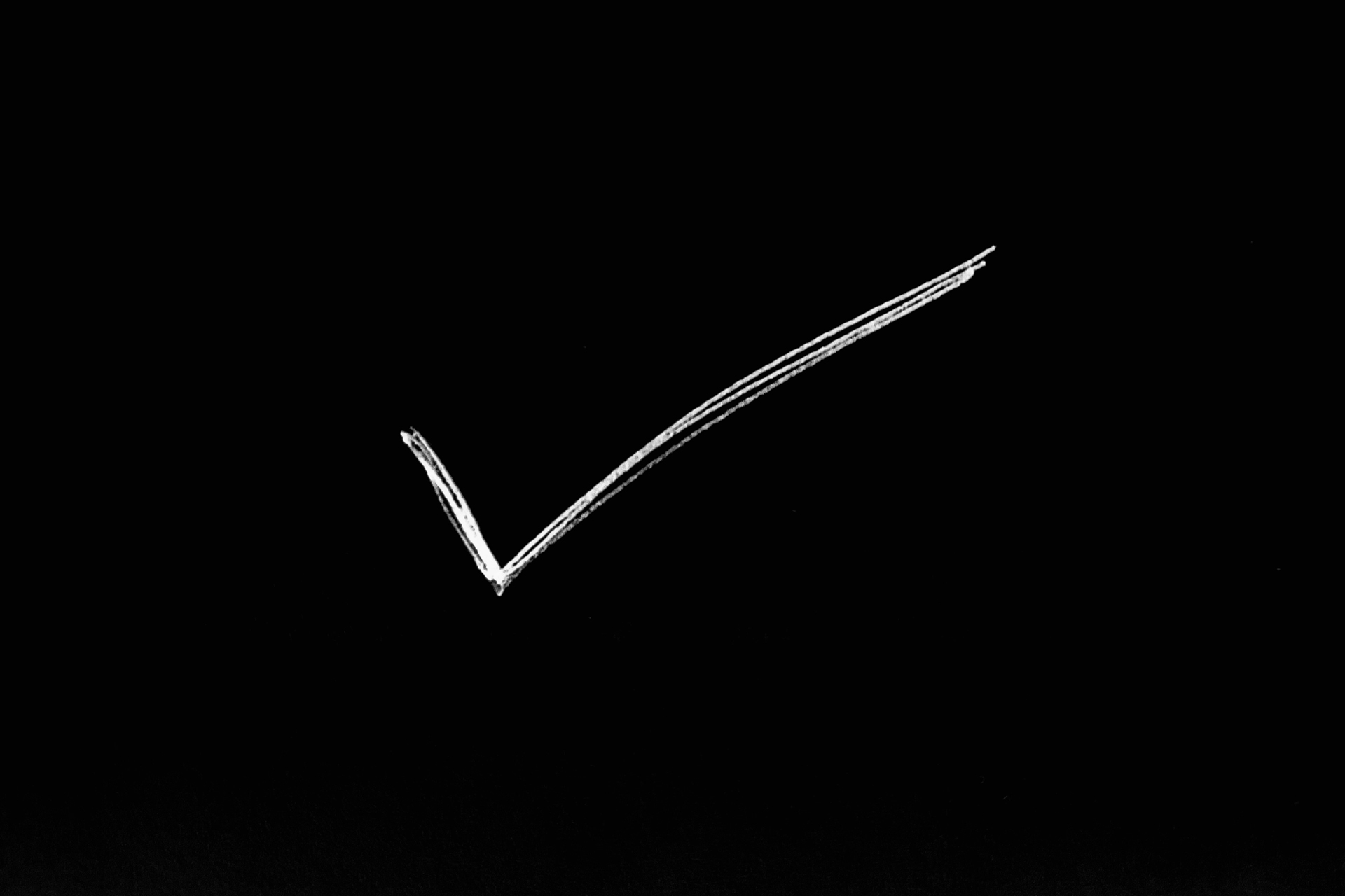
“Well, I’m not in love with it. But maybe it will grow on me.” – Phil Knight
The above quote comes from the founder of Nike when deciding to go with the now globally known “swoosh” mark. You know the one I’m talking about, right?
Keep this quote in mind when updating your logo or brand identity. As Sagi Haviv of the renowned design studio, Chermayeff & Geismar & Haviv says about logos, “it’s never love at first sight.” He explains this further in an excellent interview with Chris Do on the Futur’s podcast.
The best logos are simple and somewhat abstract marks that need to identify more than they communicate. Communication of a logo comes over time, built up by smart advertising and marketing that’s put into the brand the logo is associated with. Not the other way around.
Why do most well-known logos look so damn simple and boring these days? Well, because we ask them to do a lot of work for our brands. They need to present in a variety of sizes among different platforms, from the jumbotron at events to an app or browser icon on your smartphone. Most likely they’ll be animated too. Flying around your screen, possibly in 3D. Maybe you’ll also see them in print or on clothing. In addition, they need to maintain recognition and consistency to not loose their association with the brand they represent. All this for one little mark?!
Think about the old Verizon logo a few years back. It had that big, red letter Z in the middle of it’s name that also underlined the rest of the name, plus it had the large red V-shaped antenna-looking mark sitting on top of it. It was a mess. It tried to say too much at once. Today, it’s been reduced to a simple red checkmark. Boring at first glance compared to its predecessor, but so much more effective as an identifier of the brand. And now that we’ve seen the change, and see it used everywhere, it makes sense to us. It’s become familiar and identifiable without being complicated.
None of what a brand offers is really about the logo anyway. It’s about all the built up associations over a period of time with a product or service. If your brand is good with a strong offering, a simple, thoughtful logo can help support and emphasis it, just as punctuation does to the end of a sentence. See!
When it comes time to work through new logo designs for your company, hold on to your immediate reactions upon initial presentation. A good logo needs you to spend some time getting to know it. At first glance it may feel like there’s not been enough done to it, but sitting with it for a while you may see that there’s strength in its simplicity.
Recent Posts
How to Get Your Team on the Same Page with Your Brand Identity
Read This Before You Hire A Logo Designer for Your Small Business
Small Business Insights: Kingside Development
Improve Your Branding. Improve Your Business.
Get inspiration, insights, and resources to strengthen your branding and marketing.
Delivered to your inbox every week.
